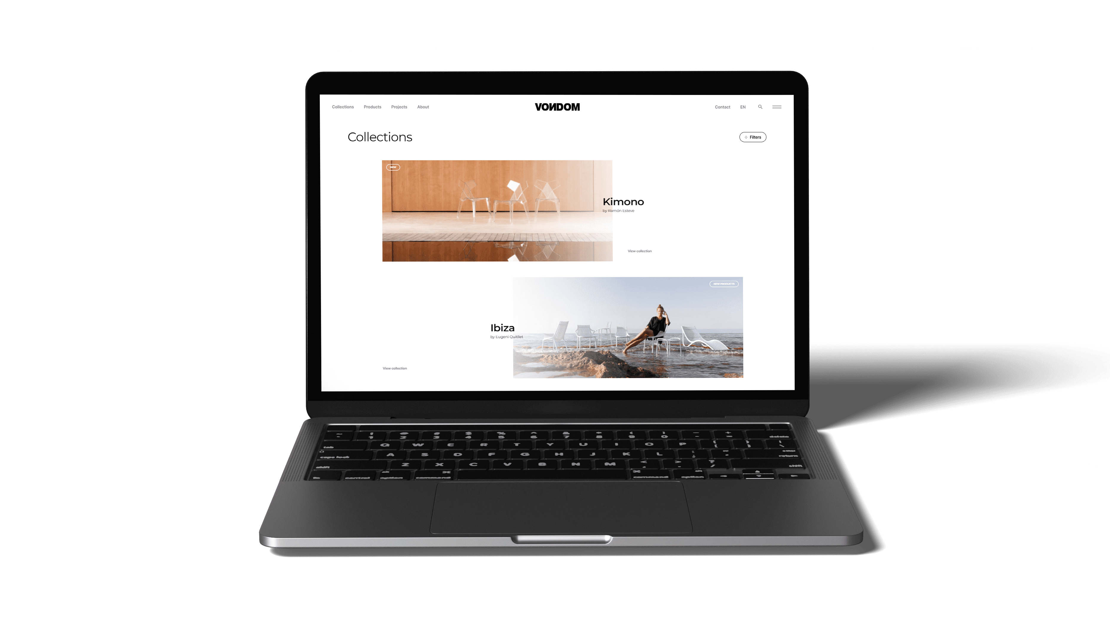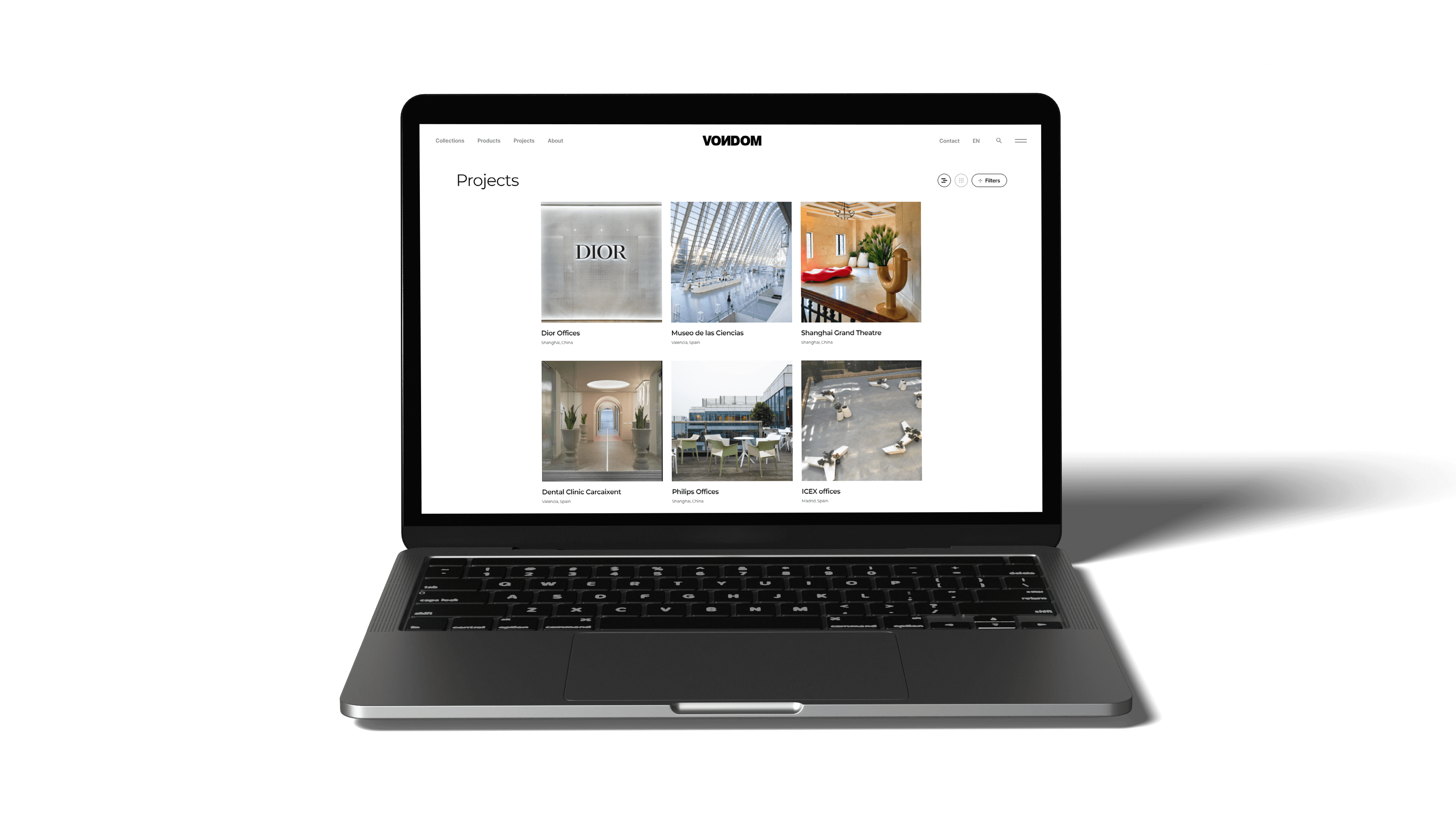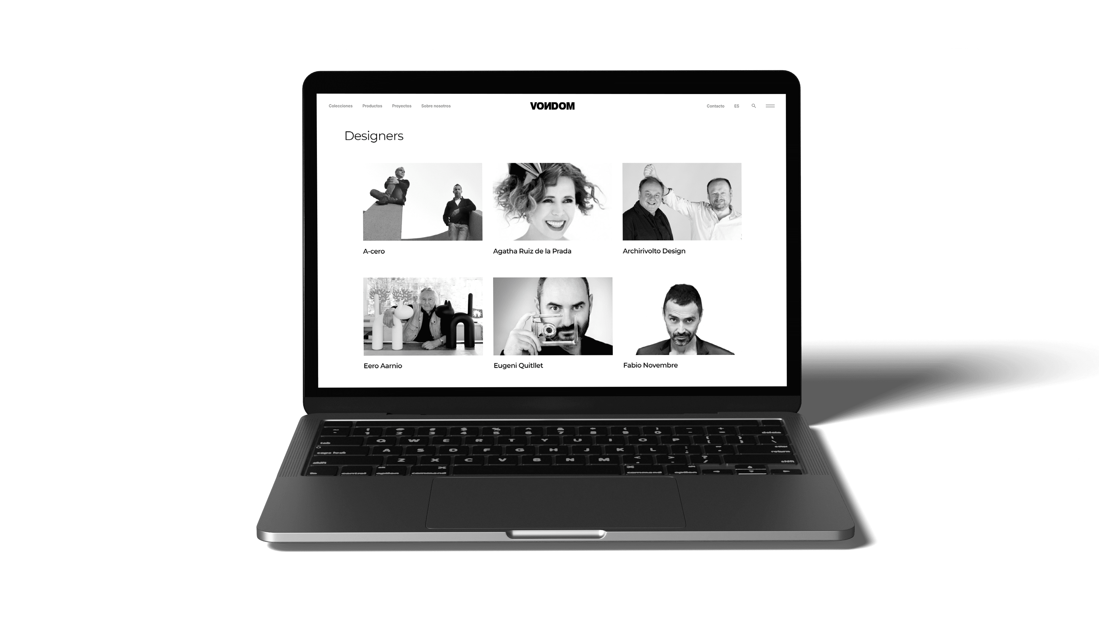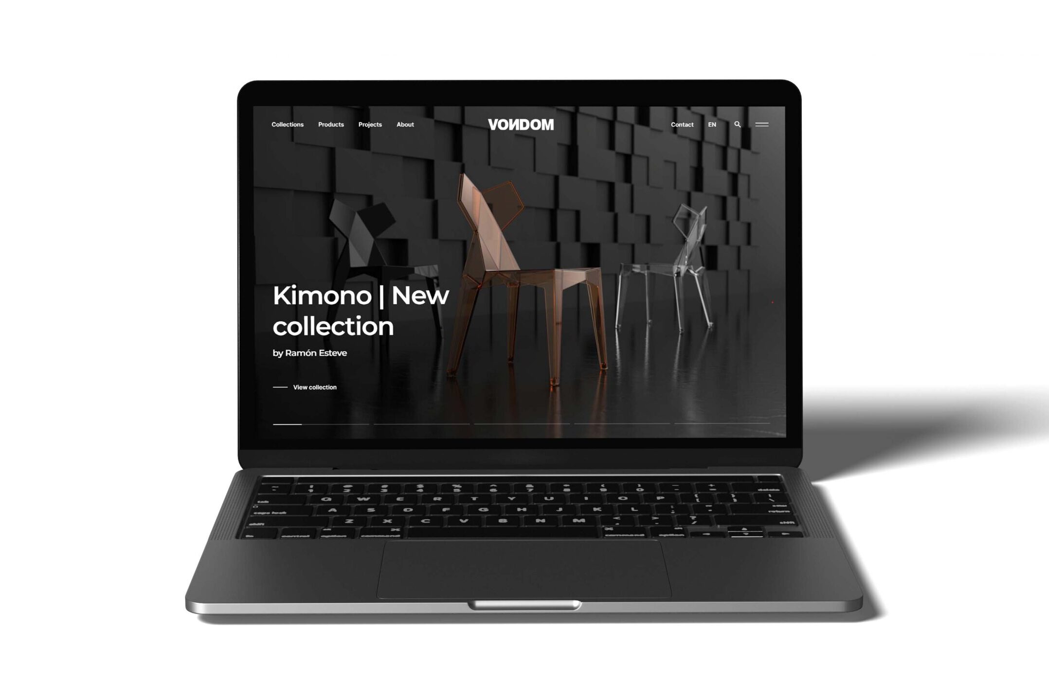
We are promoting Vondom’s image with a clear, more visual and intuitive website design to improve your “web surfing” experience.
We start this 2022, a very important year for Vondom, with our website renoval. After a continuous work to improve the presence of our image, we are looking forward to share with you this ambitious web design inspired by the latest trends.
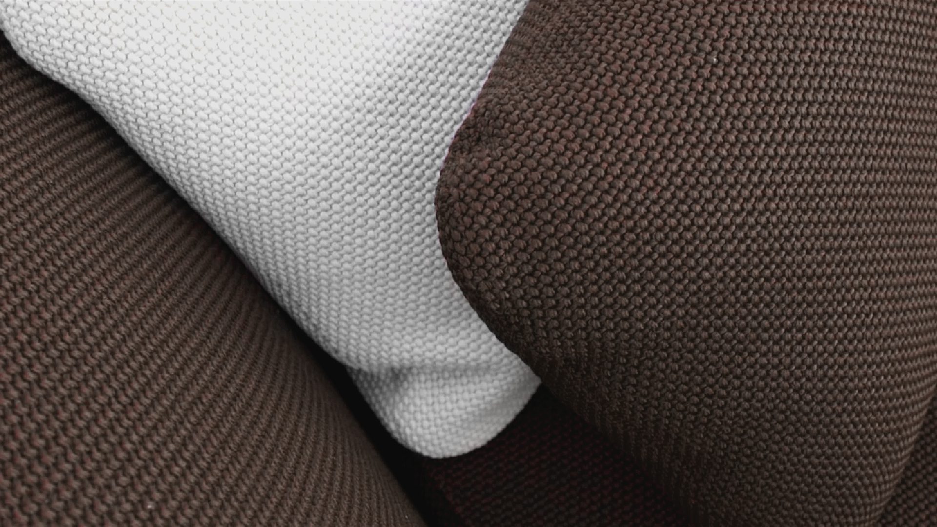
Vondom is now over 10 years old in the furniture industry, we are in a constant cycle of evolution to meet the challenge of growing as a design company. This year is very important for us. We have introduced new natural materials to out components and the incorporation of a new international designers to our portfolio.
And it is also important for our city, València is World Design Capital 2022! As the driving force behind this fantastic initiative, this change of image on the web is another step in our process of substantial and transformative change.
A new and elegant website design
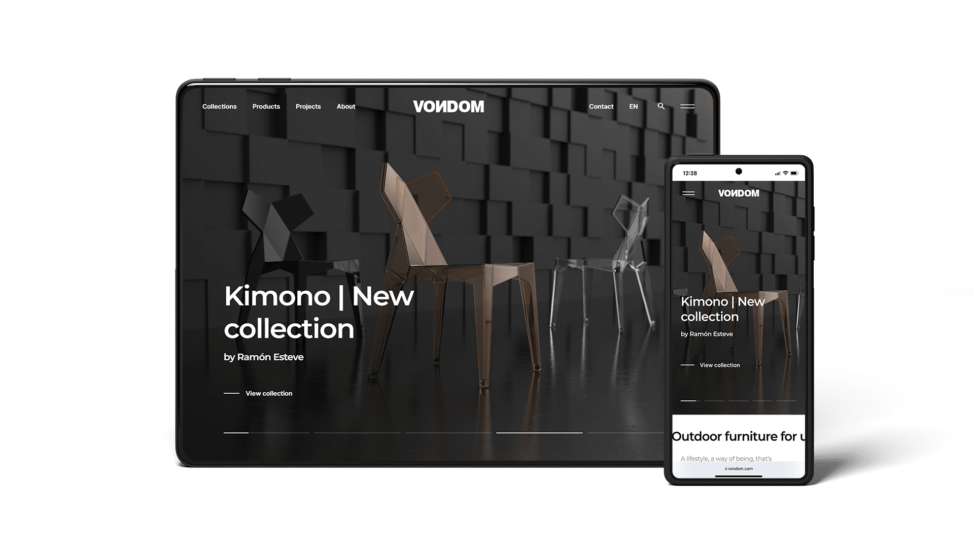
We present an elegant, minimalist and clean design adapted to the trends, where the graphic material acquires a greater prominence with larger photographs and movements that provide dynamism.
Focused to be a platform for news and inspirations of outdoor furniture design, with the aim of introduce all the news, as well as trends for residential and contract in&out atmospheres.
When a year ago our Vondom team started working with Nectar Estudio on redesigning our online image, it was clear to us that the main objective of this change would be: to better navigation for web users.
What can we offer the web user?
We asked ourselves many questions until we found the key: a more usable, intuitive and concise web page, easy to navigate. The new website design allows a more agile and dynamic navigation, being able to find much more information with much less clicks and very fast loading times. A responsive design adapted to all devices.
In addition, we incorporated a personalised customer service system that, thanks to artificial intelligence, allows us to interact consistently and quickly with the web user.
The main structure of this website design
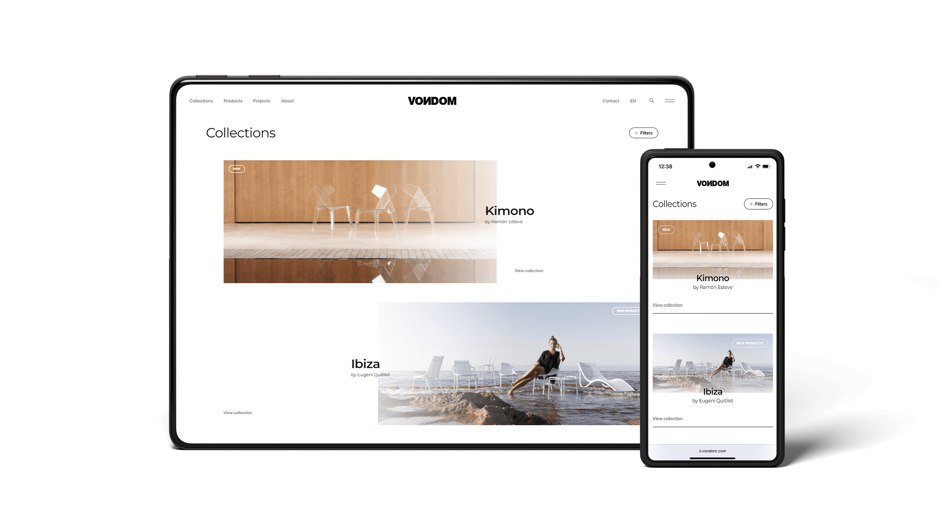
The new Vondom website has a more extensive and visual menu, which facilitates navigation between collections, products, projects and information about our company.
In addition, on the right margin we find another submenu more focused on corporate issues: news, contact, materials and care and the professional area.
It should be noted that the new website design has a downloading area with high-resolution images, product files, 3D files, Revit. As well as a press area with the press kits for each collection.
The home page of this new website design incorporates a large slider that is useful as a direct access to the latest news, collections, products, news or projects. Next, we show the three most outstanding collections of the moment and the latest projects and news in a more visual format.
Finally, it is also important that now we include many more “call to action”, from which users can ask us for information or subscribe to the newsletter.
In short, at Vondom we have opted for a renewed website design with a simple and fresh architecture to improve the user experience, making it a work tool and inspiration for the execution of a good project.
Take a look back and let us know which website design you liked the most?
We hope you enjoy it!
